It’s been great fun working with JavaFX 2.0. But before the release of Calendar Component in JavaFX I tried to create my own custom calendar component and to an extent I am succeeded in creating it.
Before going in detail about the calendar, I would like to inform you all that I had referred the EXTJS Calendar for the design reference. I tried to impose all the features that are present in that calendar.
The complete source code download you can find here.[ Download ] or at the bottom of the post.
About the Calendar
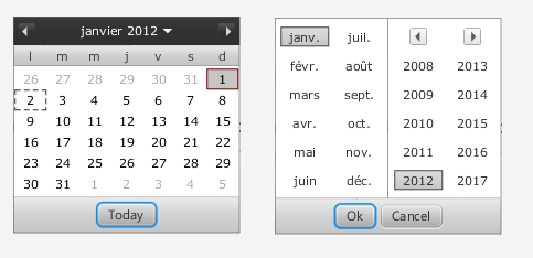
The calendar component mainly contains two panes.
- One for showing the dates of the selected month (Base Pane)
- Other for navigating between years and months (Top Pane)
Here's output of the FXCalendar that is shown as demo


On clicking the down arrow in the base pane, the top pane is displayed.
Desired month and year can be selected and upon clicking the "Ok" button, the month is displayed in the base pane.
Let’s dig deep into the component source code..
It all starts with FXCalendar class which implements a simple HBox, that consists of two children, a
- TextField - to display the selected date or modify the date, and
- Button/Image - to trigger the date picker pop up.
FXCalendar class also contains few setter/getter methods which enable us to customize the calendar to a further extend. I will discuss about those methods later in the post.
As the code for the classes are a bit large, I will just focus on the core part in the classes.
The part of code in FXCalendar class is as below:
The part of code in FXCalendar class is as below:
public class FXCalendar extends HBox {
private SimpleIntegerProperty selectedDate = new SimpleIntegerProperty();
private SimpleIntegerProperty selectedMonth = new SimpleIntegerProperty();
private SimpleIntegerProperty selectedYear = new SimpleIntegerProperty();
private SimpleBooleanProperty triggered = new SimpleBooleanProperty();
private final SimpleObjectProperty<Color> baseColor = new SimpleObjectProperty<Color>();
private SimpleDoubleProperty dateTextWidth = new SimpleDoubleProperty(74);
private SimpleObjectProperty<Date> value = new SimpleObjectProperty<Date>();
private boolean showWeekNumber;
private FXCalendarUtility fxCalendarUtility;
private DateTextField dateTxtField;
private ChangeListener<Boolean> focusOutListener;
private Popup popup;
private DatePicker datePicker;
private final SimpleObjectProperty<Locale> locale = new SimpleObjectProperty<Locale>();
private final String DEFAULT_STYLE_CLASS = "fx-calendar";
public FXCalendar() {
super();
super.getStyleClass().add(DEFAULT_STYLE_CLASS);
this.locale.set(Locale.ENGLISH);
this.baseColor.set(Color.web("#313131"));
//setSpacing(6);
setAlignment(Pos.CENTER);
configureCalendar();
configureListeners();
}
private void configureCalendar() {
final DateFormatValidator dateFormatValidator = new DateFormatValidator();
fxCalendarUtility = new FXCalendarUtility();
popup = new Popup();
popup.setAutoHide(true);
popup.setAutoFix(true);
popup.setHideOnEscape(true);
addEventFilter(KeyEvent.KEY_PRESSED, new EventHandler<KeyEvent>() {
public void handle(KeyEvent event) {
if (KeyCode.UP.equals(event.getCode()) || KeyCode.DOWN.equals(event.getCode()) || KeyCode.ENTER.equals(event.getCode())) {
initiatePopUp();
showPopup();
} else if (KeyCode.TAB.equals(event.getCode())) {
hidePopup();
}
}
});
/* Creating the date text field. */
dateTxtField = new DateTextField();
dateTxtField.prefWidthProperty().bind(dateTextWidth);
this.focusOutListener = new ChangeListener<Boolean>() {
@Override
public void changed(ObservableValue<? extends Boolean> arg0, Boolean arg1, Boolean arg2) {
// Handling only when focus is out.
if (!arg2) {
String value = dateTxtField.getText();
if(!dateFormatValidator.isValid(value)){
clear(); // TODO : Error styling for invalid date format.
dateTxtField.setText(value);
}else{
Date date = fxCalendarUtility.convertStringtoDate(value);
if (date != null) {
setValue(date);
} else {
// TODO : Error styling the text field for invalid date
// entry.
clear();
}
}
}
}
};
dateTxtField.focusedProperty().addListener(this.focusOutListener);
/* Creating the date button. */
Button popupButton = new Button();
popupButton.getStyleClass().add("dateButton");
popupButton.setGraphic(FXCalendarUtility.getDateImage());
popupButton.setFocusTraversable(false);
popupButton.setOnAction(new EventHandler<ActionEvent>() {
@Override
public void handle(ActionEvent paramT) {
initiatePopUp();
showPopup();
}
});
getChildren().addAll(dateTxtField, popupButton);
}
..
..
The DatePicker class is resided in the PopUp control, and is the place where the BasePane and TopPane’s are instantiated. DatePicker is a stackpane which holds the TopPane and BasePane in it and toggles there visibility based on the controls.
The code for the DatePicker is as below.
public class DatePicker extends StackPane {
private SimpleIntegerProperty selectedDate = new SimpleIntegerProperty();
private SimpleIntegerProperty selectedMonth = new SimpleIntegerProperty();
private SimpleIntegerProperty selectedYear = new SimpleIntegerProperty();
private Rectangle2D calendarBounds = new Rectangle2D(100, 100, 205, 196);
private FXCalendar fxCalendar;
private BasePane basePane;
private TopPane topPane;
public DatePicker(FXCalendar fxCalendar) {
super();
this.fxCalendar = fxCalendar;
selectedDate.set(fxCalendar.getSelectedDate());
selectedMonth.set(fxCalendar.getSelectedMonth());
selectedYear.set(fxCalendar.getSelectedYear());
fxCalendar.setLocale(Locale.ENGLISH);
setPrefHeight(calendarBounds.getHeight());
setPrefWidth(calendarBounds.getWidth());
setAlignment(Pos.TOP_LEFT);
FXCalendarUtility.setBaseColorToNode(this, fxCalendar.getBaseColor());
basePane = new BasePane(this); // Initiating the BasePane
topPane = new TopPane(this); // Initiating the TopPane
getChildren().addAll(basePane, topPane);
showBasePane();
}
..
..
}
The another important file required for implementing the FXCalendar controll is importing its related stylesheet file. The look and feel of the calendar can further be customized by changing the code of the calendar_styles.css file.
As the source code is already available in the Download link, I am inclining more towards the functionality rather than the code. So I am skipping into the actual usage of this calendar and not showing the code of other important helper classes ( BasePane, TopPane, FXCalendarCell, FXCalendarControls, FXCalendarUtility & DateFormatValidator )
Usage of Calendar
Once the java package of eight files is imported and the style sheet(calendar_styles.css) is loaded to the scene., we are all set to use the calendar and play with it.
The fxcalendar can be initiated as below.
FXCalendar calendar = new FXCalendar();
As the FXCalendar is a customised HBox (as it extends HBox), it can be used just like a normal node and can be placed anywhere in the scene.
The values (java.util.Date) can be set or get using the following methods.
calendar.setValue(date);
calendar.getValue();
Some Additional Features of Calendar
1) Internationalisation:
The calendar can be made locale specific or can change its Locale dynamially by setting the corresponding java.util.Locale to the below method.
FXCalendar calendar = FXCalendar();
calendar.setLocale(Locale.FRENCH);
Updates: Based on the comments of PhiLho, the week display implementation for Locale specific is modified. For example, for FRENCH locale the week starts with Monday, likewise for UK, ITALY..etc
The FRENCH locale specific calendar is shown as below.
2) Week Number Display:
The calendar can be set to show/off the display of the week numbers by the following method. By default it is set to false.
FXCalendar calendar = new FXCalendar();
calendar.setShowWeekNumber(true);The week numbers are displayed in the calendar as below.

3) Customizing Themes:
The calendar theme can be set to suite to your application. The theme can be set by the following method.
Note: Please make a note that it would be better if the base color is dark color, as the skin goes lighter from the base color.
FXCalendar calendar = new FXCalendar();
calendar.setBaseColor(Color.web("#940C02"));The new theme of the calendar is displayed as below.

That's it !!!!
I hope this component can be helpful, to fill the gap till the actual JavaFX Calendar component is released.
Download Link : JavaFxCalendar_v0_4.zip
All the above features are demonstrated in the demo file FXCalendarDemo.java
Happy Coding !! :)
P.S: The code may be improvised a lot. But for conceptual point of view I tried maximum to keep everything in place. Feel free to optimise the code and use ;)